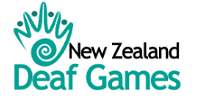
The New Zealand Deaf Games logo was designed for the 2008 New Zealand Deaf Games in Palmerston North. Deaf Sports New Zealand wanted just 3 things:
- A kiwi touch
- Deaf identity
- Feel of human bonding
Below is how the designer came to design the New Zealand Deaf Games logo.
| Step 1
Create a rough amalgamation of some concepts highlighting the main points of the logo theme. We thought of 3 concepts. 1.People holding hands– related to togetherness, bonding and happiness 2 Koru – symbol of kiwi identity 3.Hand signs used for deaf communication – symbol of deaf identity |
 |
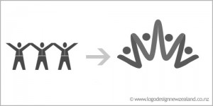
| Step 2
Next, we tried to blend the image of people bonding with a hand symbol. A beautiful graphic was created with fingers of the hand symbolising people joined in happy bonding.The concept of deaf games was strengthened by the icon created as it emphasised the solidarity of deaf identity |
 |
| Step3
The initial Koru symbol was more customised to give it an attractive twist. An abstract artistic effect was given to make it more elegant and eye catching. |
 |
| Step 4
We had to fuse the customised Koru concept with the People Icon.We integrated the two concepts into a harmonious blend where People Icon continued into the Koru graphic to form the Palm of the hand . So we blended 3 concepts into one single Icon representing Kiwi Identity of Deaf games. |
 |
| Step 5
The graphic for deaf games was complete and very much appreciated by the client. Next, we chose a suitable font which was sober and professional with sharp clarity and style. |
 |
| Step 6
Placement of font was also important as it decided the impact of the logo design. So we experimented with a few positions around the graphic to get the best presentation. But somehow we were not getting the perfect feel. |
 |
| Step 7
The client decided to add New Zealand to the logo as well. After quite a few permutations and combinations we got an excellent placement which was really creative and professional. The client was very happy with the 3 step presentation of the logo fonts. |
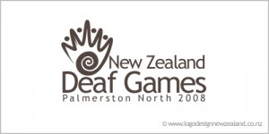 |
| Step 8The final step was adding colour to the logo.The client was very clear on the sea green colour .They loved the silver and black combination with sea green colour.This logo was very much appreciated at the Deaf Games as apart from deaf identity ,it also has a strong Kiwi feel. |
 |